
This Global Accessibility Awareness Day, York St John University will be taking part in Fix Your Content Day, hosted by Anthology Ally. To learn more about the event itself, please look at this blog post:
In this post, I will be going through possible changes you may be asked to make this Fix Your Content Day and how to make them so that your Moodle content is more accessible. With the most changes over 24 hours, we can win the Fix Your Content Day Challenge.
When To Add Fixes
Each document that is uploaded to Moodle is scanned by Ally for accessibility issues. Based off this scan, each document is given an accessibility score out of 100. If your content is given a score of 100%, then your content is perfect and there are no accessibility issues. If you are given a score below 100%, then there improvements that could be made. There is a coloured indicator to the right of any uploaded documents that quickly shows how accessible the documents are.
Below are some of the more common fixes that might be suggested, and how to fix them.
Images Without a Description
Often, students with certain disabilities use programmes called screen readers. These screen readers help disabled students read text on a screen by reading it out loud to them. However, these screen readers typically can’t read graphics or images. Alt text adds a text description to these graphics and images so that screen readers can describe what’s on the screen.
It is important that when creating alt text descriptions for images and graphics, that the description is detailed and accurate. For graphics (such as graphs) it is important that all of the information conveys the same information as in the graphic itself.
You can add alt text to images in Office 365 documents by doing the following:
- Right click the image or graphic.
- Select ‘Edit alt text’.
- You can then add your text description to the box that appears.
It is important to note, that any images or graphics that are solely for decoration, do not need to have alt text added.
Does Not Have Any Headers
A lot of academics assume that by making a header bold or underlined, that defines the heading enough. However, if these headings aren’t formatted correctly in Office 365, then screen readers will not alert the user which lines of text are titles. Due to this, it is important that headings, titles and subheadings are formatted properly in your documents.
To ensure your headings are formatted correctly, select your desired heading style from the designs panel. (These can be further customised the same way you can customise ordinary text).
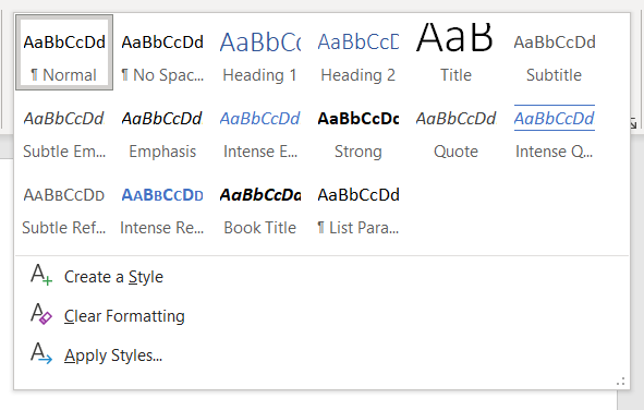
Missing Title
The title of the document is generally the first thing a screen reader would read out after opening the document. The title of your document should be a unique and specific identifier.
You can add a title to your Office 365 document by doing the following:
- Open the document you’d like to add a title to.
- Select the file tab.
- Under the file tab, select info on the left.
- Under the heading ‘Properties’ find where it says ‘Title’ and add your title.
- Then you can save your document.
Colour/Contrast Issues
If it is suggested that your document my have colour and contrast issues, then you may find that the document background and the content are too similar in colour. For example, yellow text on a white background would flag colour/contrast issues. When creating content, you should avoid using text and backgrounds which are too similar in colour, this would be a low contrast colour scheme and could be hard to read for some students.
To fix this, we suggest picking high contrast colours for your documents. The most obvious choice for this would be black and white however, your choices aren’t limited to this. Any two colours which stand out against each other would be a great choice.
See below for more colour combinations which would be considered high contrast for your documents. And also colour pairs that should be avoided; such as ‘vibrating’ contrasting colours.

(https://www.axiell.com/blog-post/accessibility-101-color-contrast/)
PDF Not OCRd/Tagged
When you scan a document into a PDF, on its own, this document basically becomes one large graphic. Due to this, the PDF cannot be interpreted by screen readers. By OCRing your scanned document, you are converting the scanned image into text so that students who use screen readers will be able to access the document.
OCRing a PDF doesn’t just benefit disabled students, but all students. This is because OCRd documents are also text based which makes them searchable and therefore, easily navigated.
Your PDF files can be automatically OCRd using Adobe Acrobat and Acrobat is compatible with all Office 365 documents.
Tables That Don’t Have Any Headers
Tables are super useful for displaying information, however, they can be a big issue for screen reader users when the table isn’t formatted correctly.
It is important when creating a table to remember that you must use headings on your rows and columns the same way you would for any other part of the document. Doing this ensures that the table can be read aloud properly by screen readers.
Some tips for when you create an accessible table:
Screen readers will read tables from left to right, top to bottom, so make sure your table makes sense this way.
If the table you’ve designed has been made correctly, then you do not need to add alt text to it.
Recent Comments