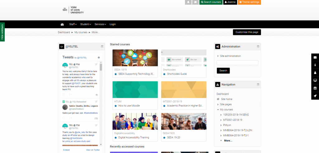
New Moodle Theme Testing
In preparation for the Moodle upgrade, the TEL team undertook testing focusing primarily on the new theme. We asked academic staff to carry out some common tasks in Moodle and checked whether they had any problems in the new theme. We also collected their feedback and have then been able to take that into consideration and make some adjustments to the site which we hope have made it easier to use. Thank you to all the staff who were involved in testing.
We received considerable positive feedback from academic staff.
Some of the positive comments we received included:
-Massive improvement
-More personality
-Cleaner
-More in line with the brand
-Recently accessed courses block will be useful
-Navigation easy to work with
-80% good – anything takes a bit of time to get used to
-Different ways to display courses in dashboard are helpful
-Liked collapsed topics format and course management button
-Liked black on white, and sans serif font
-Looks good, cleaner, fairly intuitive, liked it
-Course image is good
Of course, there were also some negative comments:
-The slider was seen by some as an unnecessary distraction
-Multiple blocks on the sidebar were distracting
-Lack of ability to see the full course title in course blocks on the dashboard was seen as an issue
-Someone found it difficult to find the search button until it was pointed out
We received many suggestions during testing and also following the Moodle upgrade with ways that we might improve the site. We welcome these suggestions and hope you will continue to let us know what you think of the new version of Moodle and if you are having any issues.
Changes that we have been able to implement so far include:
-adding the module code to the dashboard course display to make it easier to access modules
-changing the font size of breadcrumb menu, hide/show sidebars button and search button
-changing the colour of hide/show sidebars button and search button to make them more obvious
-making the hidden content sections stand out by greying out the text
-removing social media icons at the top of the screen to remove unnecessary distractions
-removing bookmark option as obstructing ‘Turn editing on’ button
-A-Z of participants selection made clearer

Thank you very much to Daniel Fitzhugh and the Website Team for making a lot of these changes so quickly. Also, a big thank you to Rob Hardy for playing such a big role in the Moodle upgrade.
Please keep getting in touch with any suggestions you might have on how we can make Moodle better and we’ll do our best to follow up.

0 responses on "New Moodle Theme Testing"